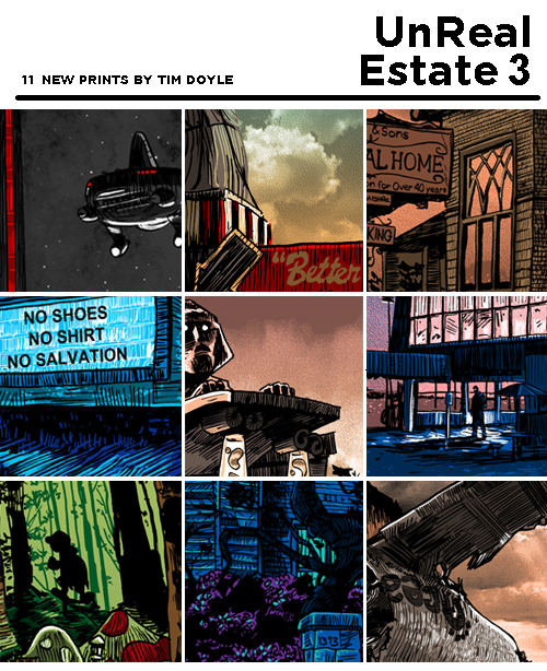

UnReal Estate 3, full show reveal and walk-through!
For the third year in a row, SpokeArt’s February show is up to Little ‘Ol Me, and if the last two years are any indication, I’m going to be a complete emotional wreck, right up until the opening, where people will say nice things to me, and I’ll have my personal and artistic validation needed to make it through to the following year. Barely. Sigh.
My pitch for UnReal Estate two years ago was this-
“Unreal Estate” is a collection of locations that many of us know and have been to on a weekly basis at times, but we can never actually visit. These places are in our memories- transmitted and entrenched there through a cathode-ray tube. Some of us have been going to these places for decades- some of these places were taken from us, way too soon.”- Me, two years ago.
When the second show was such a hit, even bigger than the first year, the third show was a given! Each time I think I’ve exhausted the locations I’d like to draw, I give it a couple weeks, and I’m jones-ing again. Like the pop-culture junkie I know myself to be. My name is Tim Doyle, and I have a television problem.
ANYWAY- here’s my yearly pre-show walk-through, where you can see all the prints that will be featured at the opening, this THURSDAY, 2/6 at SpokeArt on Sutter St. in San Francisco!
Read more after the jump!
 “Fisher Men” 18×24. Edition of 100, Glow Edition of 25.
Six Feet Under was a show I REALLY wanted to get to last year, but just ran out of time. So it was the first one I started on for this year’s show. I actually did this piece back in April, originally. I work on this show all year, between other gigs.
Six Feet Under was, in my opinion, HBO finding it’s legs. It walked that line between episodic and serialized. There were definitely story-lines and character arcs that carried over for a full season, but most of the earlier episodes seemed to feel more like THE BEST of network television, instead of THE BEST OF TELEVISION OVERALL that we’ve come to expect from HBO in recent years. But thankfully, the show was able to expand and grow, and really find itself, which built to probably the BEST AND MOST SATISFYING last episode of any show…ever. The show was obsessed with the one thing we try to hard to ignore in our day-to-day lives- our mortality. For it to end with showing the final seconds of each and every lead character’s life that we’d come to love in the previous years…it was satisfying in a structural and emotional way that nothing has come close to.
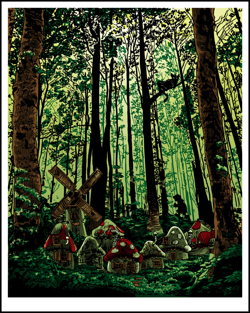
“Three Apples High“- 16×20 edition of 125
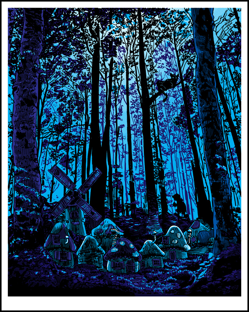
“Three Apples High“- variant edition of 35.
There are always a few prints every year for this show that I do JUST BECAUSE I want to do them. The Sesame Street and King of the Hill prints from year one, and the Downton Abbey and Mr. Rogers one from year two are other examples. They’re prints that I feel very strongly about, fully aware that to most people, they’re not ‘cool’ or ‘current’ or ‘what the heck is this guy thinking?’ Hey, I did a Smurfs print. No regrets. I love how weird and whimsical that show was. Think on this one for a while- the Smurfs first appeared in comic book form back in 1958. The Smurfs had their 50th anniversary back in 2008, and no-one seemed to give a Smurf about it. Personally, their INTENSE cross-gender merchandising campaign of the 80’s here in the states is a serious cultural touchstone for people my age. Also- Gargamel is a cautionary tale about what happens when an old man lives by himself with a cat, while wearing a dress. Seriously, what the heck, Gargamel? I remember seeing the film, “Smurfs and the Magic Flute” back in ’83 in the theater, and they were described as being ‘Three Apples High’, which stuck with me obviously.
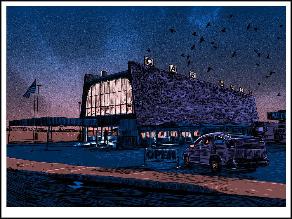
“Laundry” 18×24 edition of 150, glow edition of 25.
Ah, Breaking Bad. I had to do it. It was…too immense not to. I like the fact that this car-wash is a real place- Octopus Car Wash in ABQ, New Mexico. And now that real world location has taken on the fictional legacy of being a laundry for a meth-empire’s money. The fictional informing our concept of the real. I’m hoping the owners of the actual place are milking it for all it’s worth.
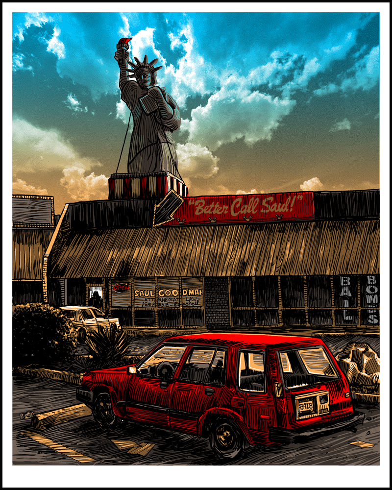
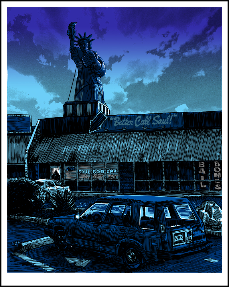
“A CRIMINAL Lawyer“- 16×20 edition of 150
 “A CRIMINAL Lawyer“- 16×20 variant of 50
I’m sure if you’re anything like me, you’re anxiously awaiting the Breaking Bad spin-off show featuring Saul Goodman. Breaking Bad was such a perfect gem of a show that you didn’t want to leave, but now that it’s over, you’re afraid a spin-off could diminish your appreciation of the source material. Is it going to be a ‘Frasier’ and surpass the original show? Or will it be a ‘The Lone Gunmen’ and kinda make you hate life itself? All I know is that I hope there’s more Huell. (Who, incidentally, is in the window there…)
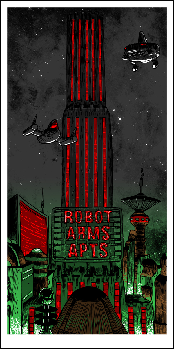
“1313” 18×24, edition of 125

“1313” glow and metallic ink variant- 18×24, edition of 35
The MUNSTERS is another show that I love and HAD to do a print for. It’s such a weird animal. Airing in the mid-60’s, the show skewered the appearances and values of other more traditional and conformist sit-coms at the time, while also depicting a fairly sweet family dynamic- even if it’s a family of monsters. Tapping into the resurgence of the Monster Craze of the 60’s, the show also featured a couple of RIGHTEOUS rides designed by custom-car legend, who also designed such iconic rides as the 60’s Batmobile, the Beverly Hilbililes’ cars, and KNIGHT RIDER.
The Munsters’ home at 1313 Mockingbird Lane is a back-lot set dating back to 1946, and is still in use today- most recently on Desperate Housewives, of all things. This type of thing is exactly what UnReal Estate is about- the locations never go away, we remember them, even when new families are living there. (But seriously, the Munsters might have let the yard go to hell, but I’m guessing they were better neighbors than the Desperate Housewives crew…)
The variant on this print glows in the dark AND features 2 metallic silver inks, giving it the ‘GLORIOUS BLACK AND WHITE’ look of the original show!
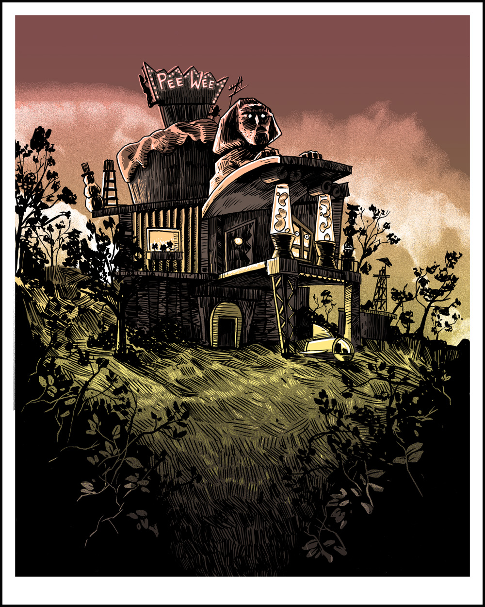
“Get Out Of Bed” 16×20, edition of 125

“Get Out Of Bed” Glow Variant- 16×20, edition of 35
Pee-Wee’s Big Adventure is in my top 5 films of all time. It’s just perfect. I fell in love as a kid, and it never wore off. So, when Pee-Wee’s Playhouse debuted back in 1986, I was already primed to fall in, hard.
I had a rubber band ball. I kept a foil ball of all the tin foil my mom wrapped my sandwiches in. (Or, until it started to smell…should have washed the mayo off first.) Pee-Wee’s Playhouse was a wild flight of imagination and insanity, every single episode. And unsurprisingly, the show packed in some serious talent- from Nick Park (who would later create Wallace and Gromit) and his Penny cartoon shorts, to the lead designer Gary Panter, and character designer Wayne White- their effect on art and culture for the next few decades can not be denied. How this all TALENT coalesced into a children’s show and still made it on air is amazing to me. And bless you Paul Reubens for making it happen.
Also, Cowboy Curtis is Morpheus. That is all.
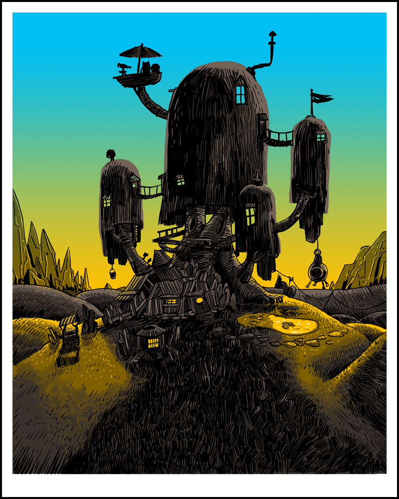
“Dawn over Ooo”– 16×20 edition of 125
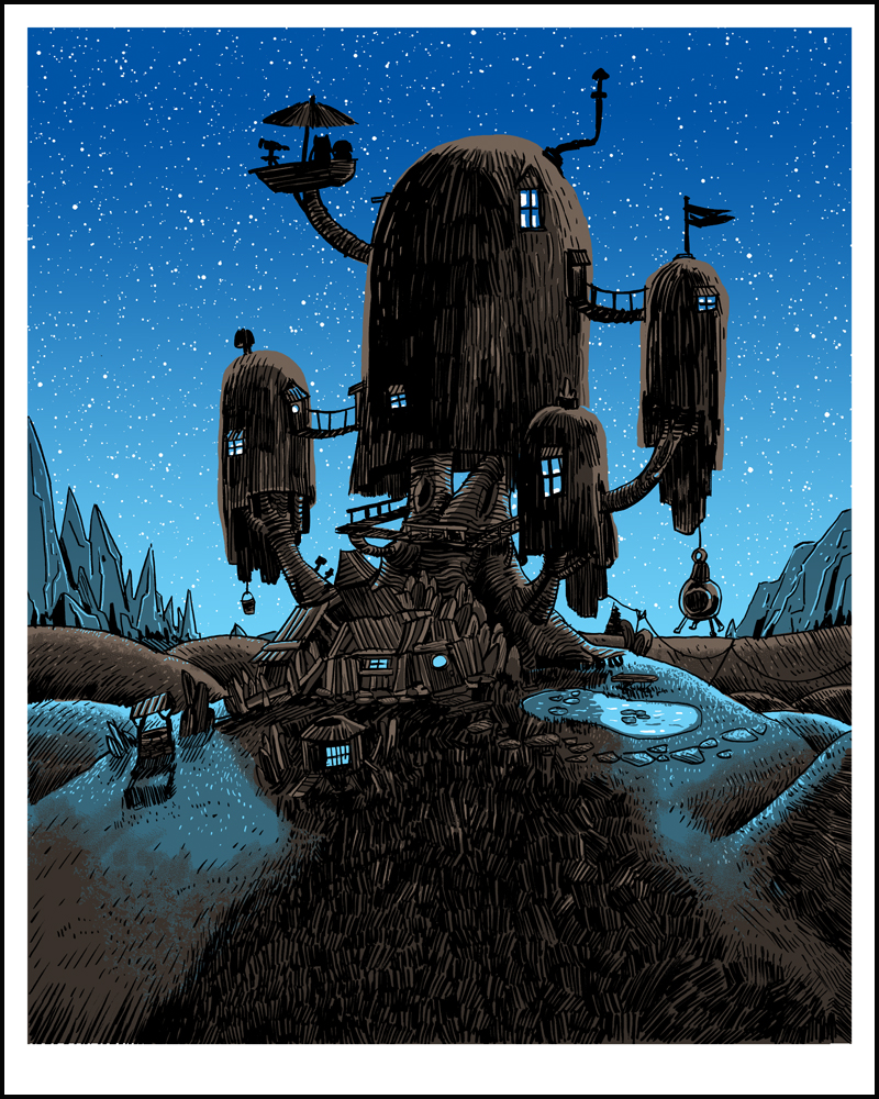
“Night Over Ooo” GLOW edition- 16×20 edition of 50
And speaking of wild flights of imagination- this show stalked me. I saw it every once in a while. I knew it was good. EVERYONE TOLD ME SO ALL THE TIME. I was just afraid to get sucked into another program. Well, it got me. It finally got me late last year. It’s just a perfect thing. I love it, my kids love it…what else do you want out of life?
FYI- this one glows GREAT. The whole night sky lights up. Really pleased with it.
“2 Cubic Meters and a Closet”- 12×24 regular edition of 125, glow edition of 40.
This is the second time I’ve visited New New York, and I LOVE the place. I’m sad the show is over with, but we had way more of it than we had any right to expect.
Again, I KINDA went overboard on the glow on the variant on this print…
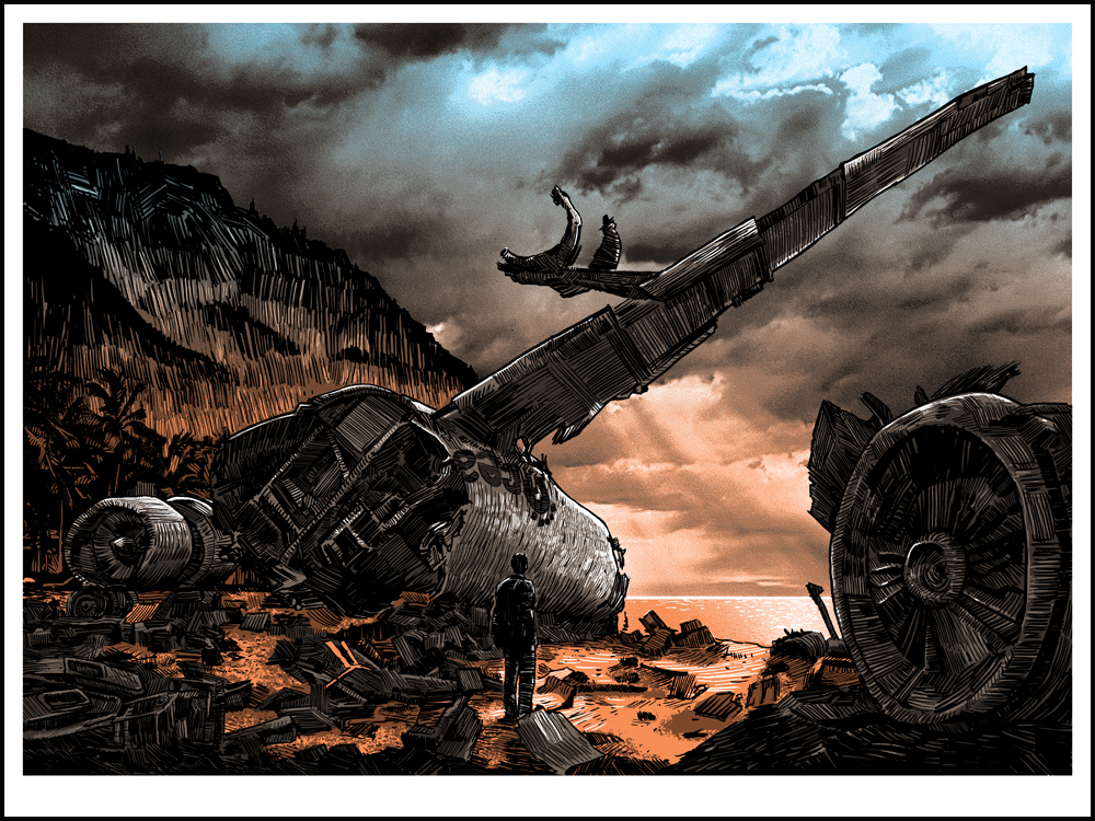
“Didn’t Stick the Landing”- 18×24, edition of 150
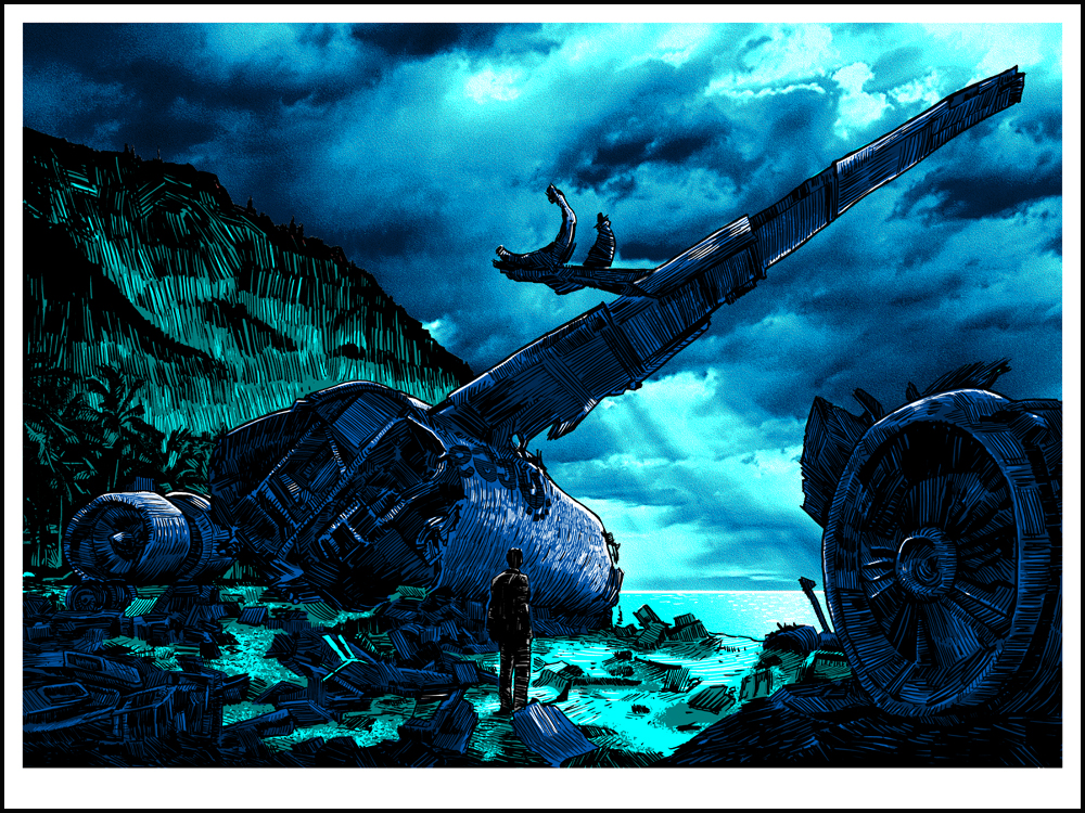
“Didn’t Stick the Landing”- variant- 18×24, edition of 50.
I have a…complicated relationship with this show. I was very, very angry at the ending. Upon further reflection though, I think it was because I was totally and completely enthralled by the first few seasons, and just about anything would be a let-down. Prepping for this piece, I re-watched the initial 5-6 episodes for the first time in a long while, and I was completely FLOORED by how good it was. That pilot episode in particular is just about the best thing I’ve seen come out of network TV in a very long time. The image of the plane wrecked on the beach is STRONG. Disaster in paradise. Love it or hate it though, you can’t deny the power and legacy of that show. Just about every new television season seems to have 3-4 new adventure shows trying to capture the formula. I think this one might be my favorite of this year’s prints, but I just do so love drawing broken things…
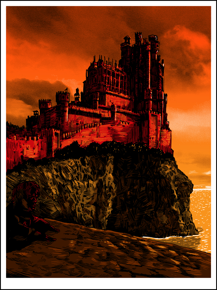
“Red Keep”- 18×24, edition of 125
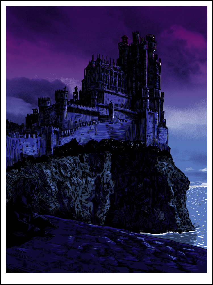
“Red Keep” GLOW variant- 18×24, edition of 50
HBO does it again. Seriously- Netflix, HBO, and AMC have my entertainment sewn up. I don’t think I’d use any other channel if it weren’t for The Daily Show and Colbert Report. So, okay- ONE more channel.
I was very skeptical about this show at first. I wasn’t convinced HBO would be able to pull off the GRAND scale of a fantasy show on a TV budget. Deadwood, one of my favorite ‘dead before it’s time’ shows was canned mainly out of budgetary concerns. “So,” I said to myself, “How are we going to see castles and dragons and huge battles and…HOLY GOD THEY CHOPPED THAT DUDE’S HEAD OFF!” Well. There you go. Having not read the books, I didn’t know what to expect, and the show has proven time and time again that you CAN NOT predict what is going to happen with this world. (IF you haven’t read the books, that is.)
It’s a LUSH and rich program that is rewriting what can be done on TV. Now if only everything else would catch up.
Again- the glow on this variant is PRETTY SWEET. It really shows off the moonlight on the water there. After about 7 years of being a silkscreen artist, I think I’m starting to figure this out.
And Finally-
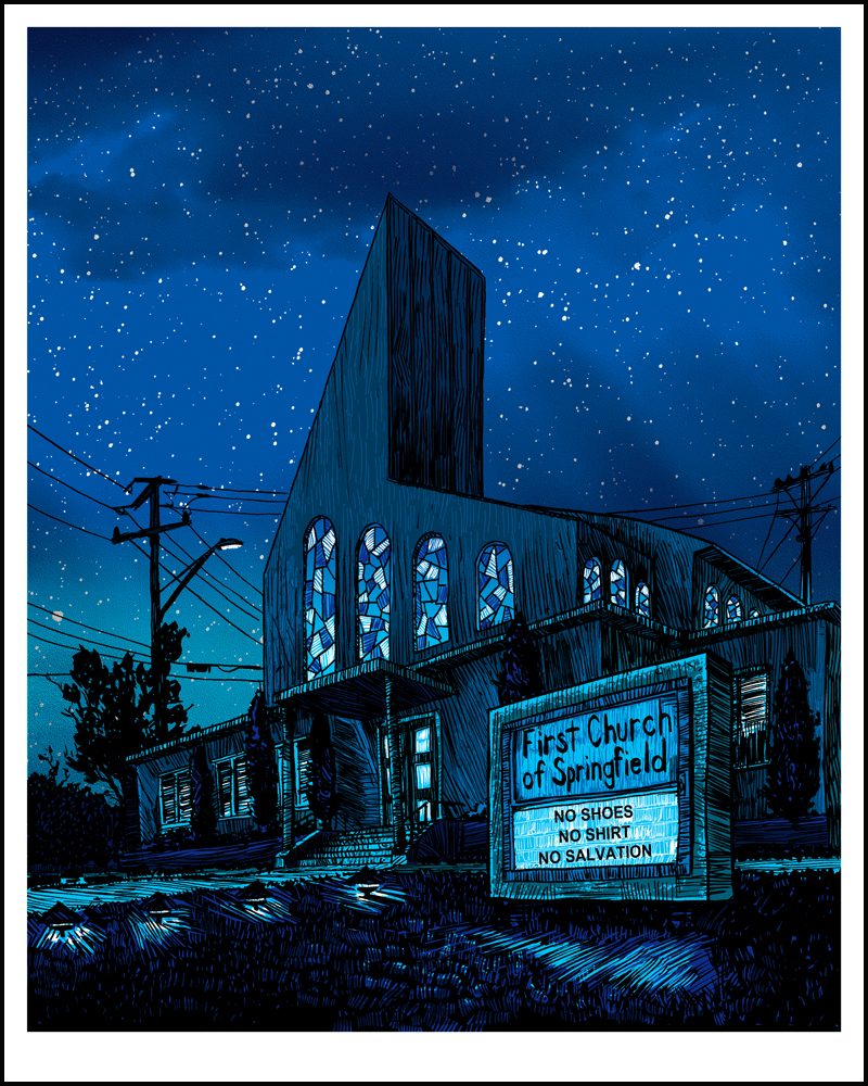
“Save Me Jebus”- 16×20, Regular Edition of 150
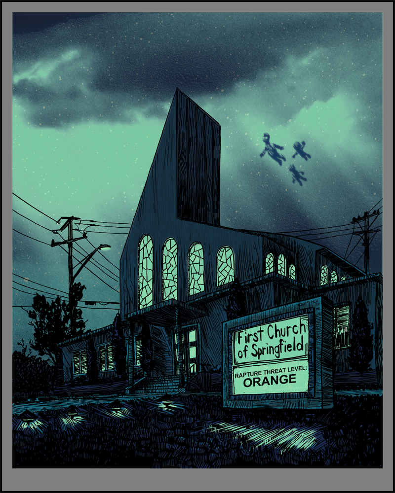
“Save Me Jebus” Glow Variant- 16×20, edition of 40. (image is a mock-up of it glowing, colors the same as the regular)
Yup- that’s a rapture going on there in this one. Doodily. One of the things I have always loved about this show is it’s really irreverent take on religion. For such a mainstream, American LANDMARK as The Simpsons are, they go RIGHT at it sometimes. And I love it.
There’s also a hand-embellished glow edition of 50 of this print, in which I’ve hand-written in a different sign-gag on each print. That print is ONLY included with the FULL SET of regular edition prints. Only 50 matched number sets will be available.
You can see almost ALL the hand-embellished prints HERE in our flickr feed, along with the original line-art drawings from the show (also available by emailing SpokeArt directly).
AND- just like the last 2 years, we’ll have a special 12×18 print that you can only get if you’re one of the first 100 people to go to the show on the opening night, or purchase the set online!
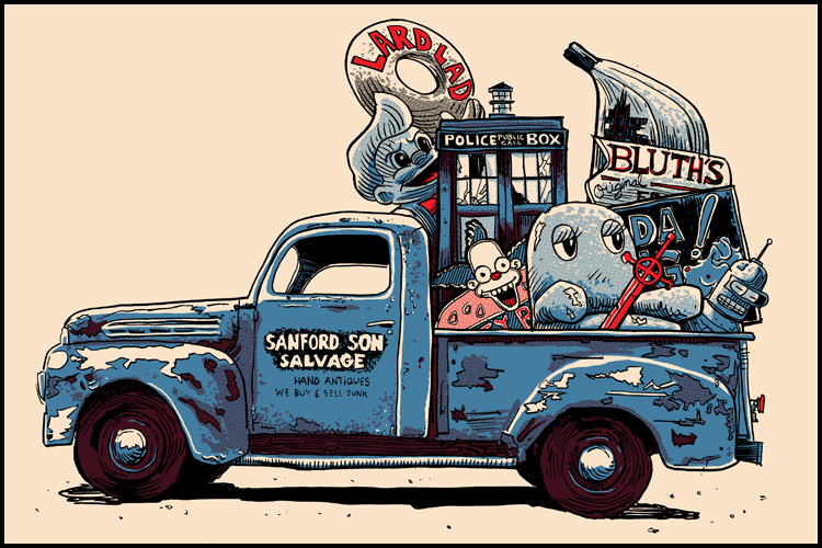
“TV Junk” 12×18.
I’ll be there in attendance, and I’m pretty sure Drinks Will Be Served. Come on out if you can, and if not, we’ll see you on SpokeArt’s site on Feb 7th for the On-Line drop of any remaining prints!
You can sign up on the Facebook event page here, if you’re going!
Thank you all!
-Tim Doyle, taking a long nap, and then thinking about UnReal Estate 4…