The brand new LoPo Gallery in San Francisco is opening with a Wes Anderson Tribute show entitled ‘Bad Dads’.
Being a giant fan of Anderson’s films, I was honored that they asked me to contribute to the show. I designed not one, not two, but FIVE prints for the show. I originally was just going to do one or two, but once I started rolling, I got laser-focused on doing the entirety of Anderson’s live-action films. And, here they are in the order that I created them-

Read More after the JUMP!
“I Found Out I Was Wrong” 12×24, 5 colors, signed and numbered in an edition of 150.
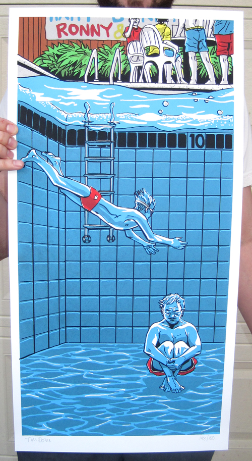
My favorite scene from the movie. Blume at this time is just broken and defeated. He’s alienated from his family and his children are complete strangers to him. So in the middle of their birthday party, right after aimlessly chucking golf balls into the pool, he just says ‘screw it’ and checks out spectacularly- via cannonball into the pool. All set to the Kinks song “Nothing In This World Can Stop Me Worryin’ Bout That Girl.” (The title of the piece is a lyric from the song.) It’s such a perfect mesh of film, performance, and soundtrack- Murray’s expression as he sits at the bottom of the pool says it all. He doesn’t know how he got to where he is in life, and he wants out.
For me, I saw this film RIGHT after a particularly messy break-up, and it just hit me at the perfect moment. There was something about the story of Max Fischer, being completely destroyed over a girl (his teacher) and after a period of wallowing in his sadness, he picks himself up again and gets right back on his horse. I wish I could say I fixed myself by staging a Vietnam War re-enactment, but I shortly thereafter did the next best thing and moved from Dallas to Austin and got right back on my horse.
I started this group of posters with the intention of doing completely new color schemes and printing techniques that I hadn’t done before. I feel like I had fallen into a bit of a repetitive pattern of a red/blue/purple palette from way back when my friend Nick Derington had done the colors for my ‘White Dragon’ print back in late 09. I’d used that set-up and variations on it for several pieces, and with my recent ‘Tears in the Rain’ print, I wanted to give it a rest for a good while. I also wanted to avoid using any half-tones at all- opting for color overlays and the ever-handy transparent black instead. Half-tones are great, but do make the prints seem more mechanical at times. And Wes’ films are anything but mechanical.

“The Death of Buckley” 12×24, 5 colors, signed and numbered in an edition of 150.
It’s weird to think of Wes Anderson films having an ‘action climax’ but this is about as close as Wes ever gets in The Royal Tenenebaums. Approaching this film, it was hard for me to pick a particular scene or character, as it’s such a great ensemble cast, that to focus on one would be to the detriment of the others. But this scene really spoke to me, as it’s the intersection of so many plot lines and character arcs all in one crazed moment. From Eli’s frenzied drive up to the house, Margot’s monotone response to the accident, Royal’s heroic saving of the children, and poor Buckley’s death. On top of that, the visual of all these letters floating around was too much for me to resist.
I will say that The Royal Tenebaums absolutely wrecks me every time I see it. I remember sitting in the late, great Dobie Theater here in Austin, Texas in mid December 2001 as the credits rolled on my first viewing, a weepy mess. The film came out 3 short months after 9/11, and I have to say that had something to do with the emotional impact of the film for me. It was great to feel a little sad, and a little happy at the same time- instead of the shock and dread that was permeating my psyche at the time.
In the printing of all of these five prints, I really wanted to emphasize the hand-made nature of screen-printing. Currently, all of Nakatomi Print Labs’ posters are hand-pulled, and I wanted to use that to echo the hand-made look and feel of Anderson’s films. In this Tenenbaums print in particular, we thinned out and watered down the colors to give a watercolor effect to it, and make each print fairly unique.

“Mutiny on the Belafonte” 12×24, 5 colors, signed and numbered in an edition of 150.
Life Aquatic is my favorite of Anderson’s films, and the one I’ve seen the most. It’s a ‘boy’s adventure’ movie, but full of sadness and regret. Strange combination, to be sure. This film came out December of 2004, and I had just SPECTACULARLY quit my previous job of running a chain of comic book stores here in Austin and took an entry level job at a movie theater/restaurant. I ended up watching the film dozens of times in the theater, on breaks, after shifts- whenever I could. Looking back on it, I guess it was a kind of therapy- sure, it might look like the best days were behind me, but you just have to keep moving forward. And hey, I was totally wrong- my best days weren’t behind me.
As I always try with my movie related prints, I wanted to depict a scene that wasn’t directly on film. This shot, which in any other film would have been a big ‘rousing speech to rally the troops’ becomes another opportunity for Zizzou to let his insecurity show. Instead of throwing down the gauntlet, his version of ‘cross this line if you’re against me’ is hesitant and confusing, and is preceded by him essentially asking “why don’t you guys like me?” My print, which seems to be depicting a ‘hero’ shot, is instead depicting a man and his flaws laid bare, very publicly. And, I was really happy to get the intern with the shoulder wound in there. And Cody. The split fountain in the sky gives the print some depth, and also makes each one slightly different.

“Mambo Guajiro” 12×24, 6 color print, signed and numbered in an edition of 150.
I have to admit- I didn’t see Bottle Rocket until right before Tenenbaums came out, and at first I didn’t like it. It pretty much defuses every expectation of plot and character, and the film itself is visually rather sparse compared to the overwhelming detail in set dressing and design in Anderson’s later movies. Obviously, back in 2001, I was a total idiot. On repeated viewings over the years, the film has grown on me considerably. Like the film itself, I wanted to go against expectations and not feature Dignan or Anthony on the print. Ines’ character is a type I can’t think of as appearing in any of the other films- she’s completely honest, earnest, and uncomplicated. The actress, Lumi Cavazos, has an pure, undeniable beauty that just comes off the screen like a fresh breeze. “Mambo Guajiro” is the name of the song playing on the radio in her cart when she first appears on screen. Compare the energy and enjoyment of Anthony and Inez’s fun mid-afternoon between the sheets to the tone of desperation in the only other on-camera Wes Anderson ‘sex scene’ in Darjeeling Limited. Bottle Rocket bucks the trend of Anderson’s other films in it’s innocence and optimism. Even after the ‘heist’ goes pear-shaped, there’s not really a trace of regret in any of the characters.
In the printing of this piece, when we laid down the blue layer for the very first time, I noticed that in Ines’ cart where the blue overprinted the red, instead of making a solid darker- blue, there was an obstruction in the screen which let the red show through. In screen printing, this happens all the time, and normally what you have to do is pull the screen and if you can’t scrub it out, you’d have to re-burn the layer. But there was something really visually appealing to me in the way those two colors looked- so unexpected but beautiful at the same time, that I just decided to let it run like it was. That’s one of the great things about running your own print shop- you’re right there on hand to make these kind of decisions. If I had sent this off to a shop to be printed, they would have (rightfully so) stopped production and fixed the problem. But for me, this ‘problem’ was not only tolerable, but desired once I saw it. I’m not much of a control freak when it comes to my art- I’d much rather enjoy the flow of the process, and if it takes me somewhere new and unexpected, so be it.

“This Time Tomorrow” 12×24, 7 color, signed and numbered in an edition of 150.
I almost didn’t get to Darjeeling Limited, as time was running short, and frankly, I had no idea what to draw. I had exactly the opposite problem as I did with Bottle Rocket- BR is a very visually sparse film, but Darjeeling Limited is a dense, rich visual tapestry. It was an embarrassment of riches. Also, with this series of prints, I had backed myself into a bit of a corner compositionally speaking, when it came to this film- trains…are…horizontal. As much as I wanted to draw a super dense Indian street scene, I didn’t think that would capture the journey of the movie or the characters. And outside of a tiny Bill Murray face, and a side shot of Ines, I didn’t have any likenesses in any of the other prints, so I didn’t want to suddenly make the final print a Hollywood poster-style portrait fest.
One of my friends who works in my print shop, Zane, suggested I do something with the luggage. “Luggage isn’t very exciting,” I said. So, I watched the film again and damn it- he was right. It’s right there at the end of the film, as the brothers race for the Bengal Lancer- “Dad’s bags aren’t going to make it,” Francis says, and then the other brothers smile and they let go, and at the same time let go of the baggage of their upbringing, of their father’s death, and their mother’s detachment. It’s a simple metaphor, and a little heavy handed, but it’s beautiful regardless.
The title of the print is the title of the Kinks song playing as Adrian Brody leaps aboard the train at the start of the film.
This print has the most colors I’ve ever done on a poster of mine, and I don’t think I can ever go back now. The split fountain in the background was intended to be streaky in order to convey the idea of movement, and the yellow sky and brown dusty earth in the film. Even though this one was drawn the fastest, I think it’s the one I’m the most proud of in the set.
The gallery will begin selling these prints at the show, and later on-line from the website of the showing’s organizer, www.spokeart.net. The anticipation for this show is high, and there is a very good chance the prints will sell out from the gallery and their site. IF they don’t sell out, NakatomiInc.com will have some available later. But do keep in mind, I am not holding any back for that specifically, so I do suggest trying to get the prints from the gallery.
Bad Dads is open from October 30 at the LoPo Gallery, 1171 Polk St., in San Francisco, CA. Gallery hours are noon-7 p.m. Tuesday through Saturday. The art will be for sale at www.spokeart.net.
Thank you.
-Tim Doyle